
Navigating the cryptocurrency markets requires more than just a cursory glance at a price chart. Novice traders often make the mistake of fixating on a single view, such as the 15-minute or hourly chart, and reacting impulsively to every minor fluctuation. This "tunnel vision" can lead to entering trades that oppose the broader market direction, resulting in frustrating losses. To trade effectively, one must adopt a multi-timeframe approach that contextualizes short-term movements within the larger picture.
Multi-timeframe analysis involves monitoring the same asset across different time intervals to gauge the overall market sentiment. By aligning short-term entry signals with long-term trends, traders can increase the probability of a successful trade. This strategy prevents fighting against the tide. It ensures that a momentary dip on an hourly chart is identified correctly—either as a buying opportunity in a bull market or the start of a collapse in a bear market.
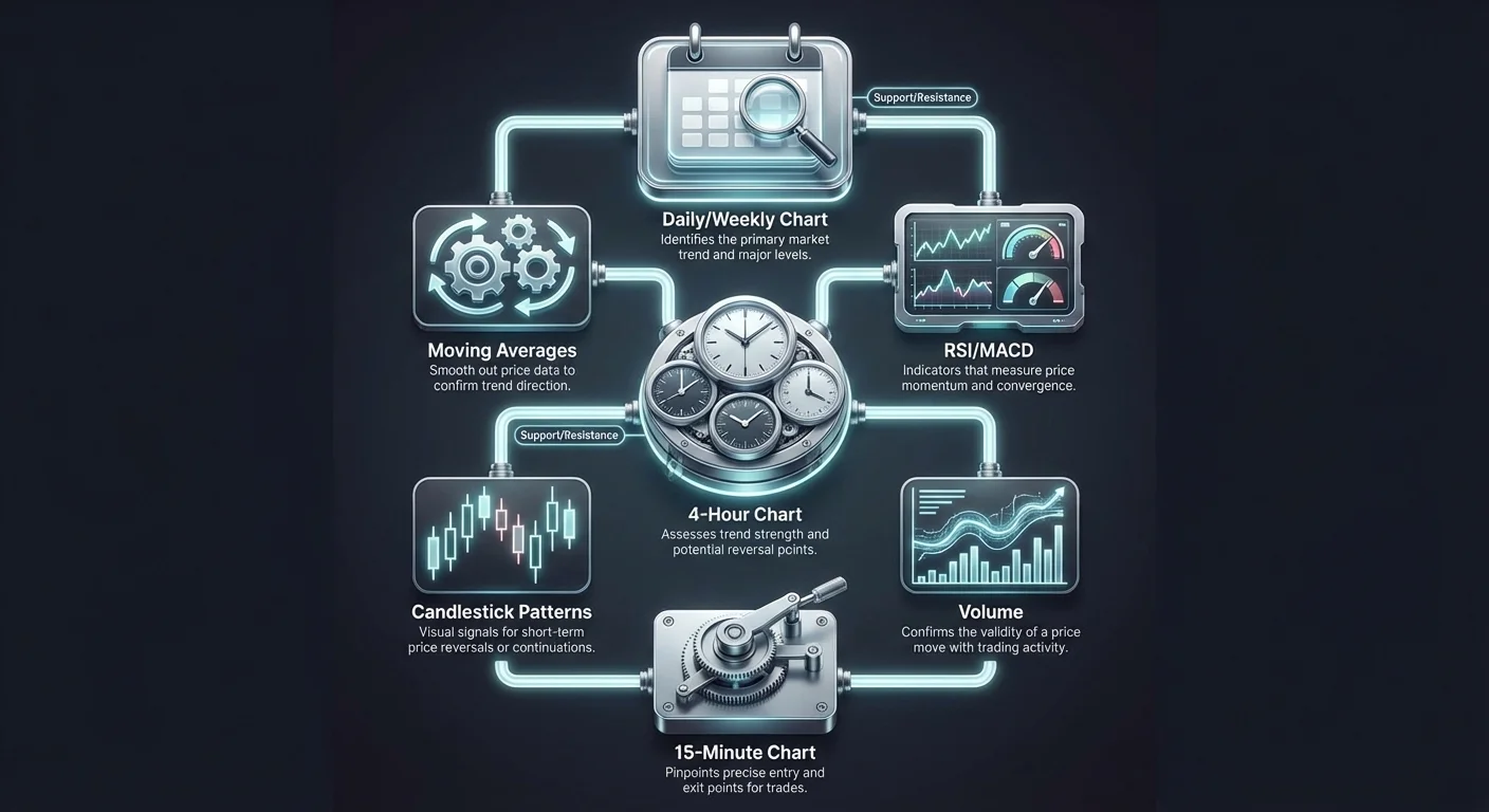
Successful alignment requires understanding that different timeframes reveal different types of information. Weekly and daily charts show the dominant trend and major support levels. Four-hour and hourly charts reveal intermediate trends and momentum shifts. Shorter timeframes, like the 15-minute chart, are used solely for precise execution. Integrating these views creates a holistic strategy that balances patience with precision.

The Three Pillars of Market Analysis
Before diving into specific charts, it is crucial to understand the analytical frameworks that underpin trading decisions. A robust strategy combines three distinct approaches: fundamental, technical, and sentimental analysis. While technical analysis is the primary tool for timing entries, the other two provide the necessary context for why a trend exists.
Fundamental Analysis Context
Fundamental analysis assesses an asset's intrinsic value. In traditional markets, this involves revenue and balance sheets. In crypto, it focuses on network adoption, hashrate, and tokenomics. For Bitcoin, factors like the "halving" cycles and institutional adoption rates are critical. Fundamental analysis tells you what to buy and generally why the price should move over the long term. It helps determine if an asset is undervalued or overvalued based on its utility and market position.
Technical and Sentimental Layers
Technical analysis is the study of price action and volume to predict future movements. It assumes that historical price behavior repeats due to collective human psychology. This is where multi-timeframe analysis lives. It uses chart patterns, indicators, and support levels to determine when to buy or sell. It decodes the "what" provided by fundamentals into actionable trade setups.
Sentimental analysis gauges the mood of the market. It evaluates whether investors are driven by fear or greed. Tools like the Fear & Greed Index or social media volume help quantify this. High sentiment often precedes a correction, while extreme fear can signal a bottom. Combining these three pillars ensures that a technical entry on a chart is supported by actual value and market psychology.
| Analysis Type | Focus | Key Question |
|---|---|---|
| Fundamental | Value & Adoption | Is this asset worth buying? |
| Technical | Price & Charts | When is the right time to enter? |
| Sentimental | Psychology & Mood | How are other traders feeling? |
Decoding Price Action with Candlesticks
The foundation of technical analysis lies in the ability to read charts effectively. While line charts offer a simple overview of closing prices, they lack the detail required for precise timing. Bar charts provide more data but can be visually difficult to interpret quickly. Candlestick charts are the preferred tool for crypto traders because they tell a detailed story about the battle between buyers and sellers during a specific period.
Anatomy of a Candle
Each candlestick represents a specific timeframe, whether it is a minute, a day, or a week. The thick part of the candle, known as the body, illustrates the difference between the opening and closing prices. If the close is higher than the open, the body is typically green, indicating bullish pressure. If the close is lower, it is red, signaling bearish dominance. This color-coding allows traders to instantly assess market momentum.
The thin lines extending from the body are called wicks or shadows. These represent the highest and lowest prices reached during that period. Wicks are critical for identifying rejection. A long upper wick suggests that buyers tried to push the price up, but sellers forced it back down. Conversely, a long lower wick indicates that sellers pushed the price down, but buyers stepped in to recover the value.
Recognizing Key Patterns
Candlestick patterns serve as visual signals for potential reversals or continuations. A "Hammer" pattern, characterized by a small body and a long lower wick, often signals a reversal at the bottom of a downtrend. It shows that selling pressure was absorbed and buyers are taking control. The "Shooting Star" is the opposite, signaling a potential top.
Engulfing patterns are also powerful signals. A bullish engulfing pattern occurs when a large green candle completely overlaps the previous red candle. This suggests a strong shift in momentum favoring buyers. Recognizing these patterns on short-term charts, such as the 1-hour, can provide the trigger for entering a trade that aligns with a longer-term trend.
The Macro View: Establishing Direction
The first step in multi-timeframe analysis is zooming out. Daily and weekly charts act as the compass for your trading journey. They filter out the "noise" of minute-by-minute volatility and reveal the true dominant trend. Trading against the macro trend is risky and usually results in lower success rates.
Moving Average Crossovers
A primary tool for identifying long-term trends is the moving average crossover. The "Golden Cross" is a classic bullish signal. It occurs when a short-term moving average, such as the 50-day, crosses above a long-term average, like the 200-day. This event signifies that short-term momentum has overtaken long-term sentiment, often heralding the start of a prolonged bull market. Traders use this to confirm that the broader environment favors long positions.
Conversely, the "Death Cross" signals a shift to a bearish regime. This happens when the 50-day moving average crosses below the 200-day average. It suggests that momentum is deteriorating and a downtrend is likely. When a Death Cross is active on a daily chart, short-term rallies should be viewed with suspicion, as they are likely to be sold off.
Cycle Top Indicators
For Bitcoin specifically, specific indicators help identify when a long-term trend is becoming overheated. The Pi Cycle Top indicator has historically been accurate in signaling market peaks. It uses the crossover of the 111-day moving average and a multiple of the 350-day moving average to identify unsustainable vertical growth.
While this indicator is not for daily trading, it provides essential context. If the Pi Cycle Top signals a peak, a trader using multi-timeframe analysis would stop looking for long entries on the hourly chart, regardless of how good the short-term pattern looks. Instead, they would switch to preserving capital or looking for shorting opportunities.
The Intermediate View: Gauging Momentum
Once the major trend is established on the daily chart, traders step down to the intermediate timeframe, typically the 4-hour chart. This view is used to assess the health of the trend. Is the trend accelerating, or is it running out of steam? Momentum indicators are the primary tools used here.
Utilizing the MACD
The Moving Average Convergence Divergence (MACD) helps identify changes in trend strength. It consists of the MACD line and the signal line. When the MACD line crosses above the signal line, it generates a bullish signal. If this happens while the MACD is above the zero line, it confirms strong upward momentum.
Traders look for alignment here. If the daily chart shows a Golden Cross (bullish) and the 4-hour MACD shows a bullish crossover, the conviction for a trade increases significantly. However, if the daily is bullish but the 4-hour MACD is crossing down, it suggests a temporary pullback is in progress. In this scenario, the trader waits rather than entering immediately.
Analyzing RSI Strength
The Relative Strength Index (RSI) measures the speed and change of price movements. It oscillates between 0 and 100. Traditionally, a reading above 70 is considered overbought, while below 30 is oversold. In a strong uptrend, the RSI can stay overbought for long periods, so selling just because it hits 70 can be a mistake.
Instead, traders look for "divergence." A bullish divergence occurs when the price makes a lower low, but the RSI makes a higher low. This indicates that selling pressure is weakening despite the price drop. Finding a bullish divergence on a 4-hour chart during a daily uptrend is a high-probability setup for a trade entry.
The Micro View: Precision Execution
The final step takes place on the short-term charts, such as the 1-hour or 15-minute timeframes. This is where the actual trade execution occurs. The goal is to find a precise entry point that minimizes risk and maximizes potential reward. Entering blindly based on a daily trend can lead to significant drawdowns if the entry is mistimed.
Stochastic Oscillator for Timing
The Stochastic Oscillator is highly effective for pinpointing entries in sideways or correcting markets. Like the RSI, it has overbought (80) and oversold (20) zones. However, it is more sensitive and provides distinct crossover signals.
When aligning timeframes, a trader waits for the price to pull back. They watch the Stochastic Oscillator on the short timeframe. If the trend is bullish, they wait for the Stochastic to dip below 20 and then cross back up. This specific cross signals that the short-term correction is over and the primary trend is resuming. This allows for a tight entry with a clear stop-loss level.
Volume Confirmation
Volume provides the fuel for price moves. It is the sum of all transactions within a specific period. Analyzing volume on short timeframes confirms the validity of a breakout or reversal. A price increase accompanied by high volume indicates strong buying interest and suggests the move is sustainable.
Conversely, if price rises but volume decreases, it indicates a lack of conviction. This is often a "fakeout" or a bull trap. In multi-timeframe analysis, seeing a bullish candlestick pattern on the 15-minute chart is good, but seeing it accompanied by a spike in buying volume makes it actionable. Volume validates that big players are stepping in at your chosen level.
Volatility and Liquidity Considerations
When moving between timeframes, traders must account for the changing nature of volatility and liquidity. Volatility refers to the speed and magnitude of price changes. Cryptocurrencies are inherently volatile, but this intensity varies by timeframe.
Impact of Low Liquidity
Liquidity refers to how easily an asset can be bought or sold without affecting its price. On lower timeframes like the 5-minute chart, liquidity can be thinner. This makes the chart more susceptible to manipulation or erratic moves caused by a single large order. This "noise" is why relying solely on short timeframes is dangerous.
High volatility on short timeframes can trigger stop losses prematurely. A "wick" might crash down to hit stops before price resumes upward. By using higher timeframes to identify major support zones, traders can place their stops more effectively, keeping them safe from random short-term volatility spikes while still protecting capital.
| Factor | Short Timeframe (15m) | Long Timeframe (Daily) |
|---|---|---|
| Volatility | High / Erratic | Smoothed Trends |
| Noise | Significant | Minimal |
| Significance | Timing Entries | Strategic Direction |
Putting It All Together: The Workflow
The power of multi-timeframe analysis comes from the alignment of these disparate signals. A disciplined trader does not guess; they follow a structured workflow. This process moves from the top down, ensuring that every trade is backed by the weight of the broader market current.
The Top-Down Approach
Start with the daily chart. Ask yourself: Is the market in an uptrend, downtrend, or moving sideways? Look for moving averages like the 50-day and 200-day. If price is above these averages, your bias is long (buy). If below, your bias is short (sell). Do not look for trades that contradict this bias.
Next, move to the 4-hour chart. If your bias is long, look for the price to be in a pullback or consolidation. You do not want to buy at the top of a 4-hour extension. Look for the RSI to be cooling off or the MACD to be resetting. You are stalking the market, waiting for the counter-trend movement to exhaust itself.
Finally, zoom in to the 15-minute or 1-hour chart. This is the trigger. Wait for a specific candlestick pattern, like a Hammer or Bullish Engulfing, to form at a key support level. Confirm this with a Stochastic crossover or a volume spike. Once these align with the higher timeframe bias, execute the trade.
Example Scenario
Imagine Bitcoin is in a clear uptrend on the Daily chart, sitting well above the 200-day moving average. However, for the last two days, the price has been dropping. A novice might panic and sell. The multi-timeframe trader zooms into the 4-hour chart and sees the price approaching a previous resistance level that should now act as support.
They switch to the 15-minute chart. As price hits that support level, a "Morning Star" candlestick pattern forms. Simultaneously, the 15-minute Stochastic crosses up from the oversold zone. All lights are green: Daily trend (Up), 4-hour condition (Support holding), 15-minute trigger (Bullish signal). This alignment offers a high-probability entry.
Risk Management and Psychology
Even the best analysis cannot guarantee a win 100% of the time. This is where risk management becomes the safety net. Trading is not just about predicting prices; it is about managing probabilities and protecting capital when the market moves unexpectedly.
Stop-Loss Orders
A stop-loss is a predefined exit point that limits potential losses. In a multi-timeframe strategy, stop losses should be placed based on technical invalidation points, not arbitrary dollar amounts. If you enter based on a 15-minute setup, your stop loss might go below the recent swing low on that chart.
However, checking the higher timeframe is vital. If your stop loss is placed right where a major daily moving average sits, you might get stopped out just before the daily trend kicks back in. Effective placement balances the tight risk of the short timeframe with the structural support of the long timeframe.
Controlling Emotions
Trading psychology is often the hardest hurdle. Fear and greed can dismantle a good strategy. Short-term charts are emotionally taxing because they move fast. Seeing red candles form rapidly can induce panic selling.
By relying on the daily and weekly charts, traders can maintain perspective. If the long-term structure is intact, a scary drop on the hourly chart is just noise. Multi-timeframe analysis serves as an anchor, preventing emotional decisions driven by momentary volatility. It enforces discipline by requiring multiple conditions to be met before acting.
Conclusion
Multi-timeframe analysis is the bridge between investing and day trading. It allows market participants to respect the major economic currents driving the market while utilizing the precision of technical charting to find optimal entry points. By understanding the "what" through fundamental analysis, the "when" through technical indicators, and the "mood" through sentiment, traders can build a complete picture of the market reality.
Aligning short-term signals with long-term trends significantly filters out false positives. It prevents the common error of shorting a strong bull market or buying into a crashing bear market. While it requires patience to wait for the stars to align across the daily, 4-hour, and hourly charts, the payoff is a trading strategy that is robust, logical, and less prone to the chaotic randomness of crypto volatility.
True trading success comes from trading the big picture, not just the current candle.