
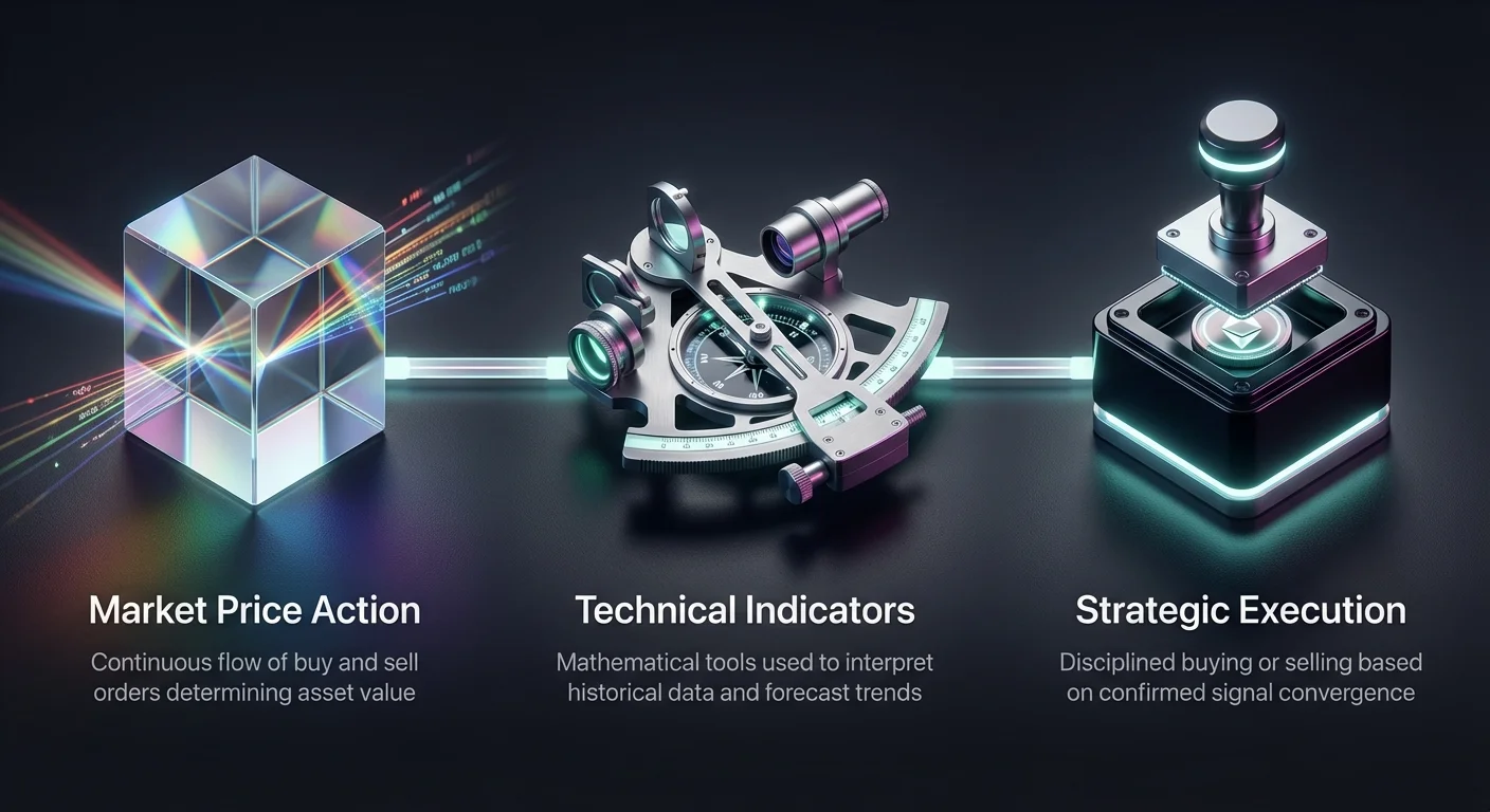
The cryptocurrency market operates with a speed and intensity that differs significantly from traditional finance. Prices fluctuate rapidly, driven by a complex mix of technological adoption, regulatory news, and global market sentiment. To navigate this environment effectively, traders must move beyond simple buy-and-hold strategies. They need to adopt dynamic trend following methods that adjust to real-time market conditions. This approach relies heavily on technical analysis, which is the study of historical price actions to forecast future movements. By mastering the visual language of charts, traders can identify structure amidst the chaos.
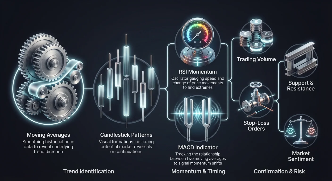
At the core of this strategy lies the ability to interpret market psychology through data. Charts are not merely lines on a screen. They represent the collective decisions of millions of participants, ranging from retail investors to large institutional holders. Dynamic trend following involves identifying the prevailing direction of asset prices and reacting to shifts in momentum. It requires a toolkit that includes candlestick patterns, support and resistance zones, and advanced technical indicators. These tools help traders distinguish between temporary noise and significant trend reversals.
Successful analysis also demands an understanding of liquidity and volume. A price movement without volume is often a false signal, lacking the conviction required to sustain a trend. Conversely, high volume during a breakout suggests strong market participation. By combining these elements, traders build a comprehensive view of the market structure. This foundation allows for more precise entry and exit points, better risk management, and a deeper understanding of the forces driving cryptocurrency valuations.
Decoding the Visual Data
The first step in dynamic trend following is selecting the right chart type to visualize data. While line charts offer a clean view of closing prices, they often obscure the volatility that occurs within a specific timeframe. Bar charts provide more data, showing the opening, closing, high, and low prices, but they can be visually cluttered. For most crypto traders, candlestick charts are the preferred tool. They provide a color-coded representation of price action that is intuitive and rich in information.
Candlesticks display the battle between buyers and sellers over a set period. A green candle indicates that buyers won the round, pushing the close higher than the open. A red candle shows that sellers dominated, forcing the price down. The "body" of the candle represents the range between the open and close, while the "wicks" or shadows show the extreme high and low prices reached. These visual cues allow traders to instantly gauge market sentiment. Long bodies suggest strong conviction, while short bodies indicate indecision.
Different timeframes reveal distinct aspects of the market. Longer timeframes, such as daily or weekly charts, highlight the broader trend and major support levels. These are essential for determining the overall market direction. Shorter timeframes, like the 15-minute or 1-hour charts, focus on immediate volatility. Day traders use these to spot short-term opportunities, but they can be noisy. A robust strategy often involves checking higher timeframes for context before executing trades based on shorter-term signals.
| Chart Type | Data Shown | Best Use Case |
|---|---|---|
| Line Chart | Closing Price | Identifying long-term trends simply |
| Bar Chart | Open, High, Low, Close | Analyzing volatility ranges |
| Candlestick | OHLC + Color Coding | Spotting patterns and sentiment |
Analyzing Price Action Patterns
Candlestick patterns are specific formations that historically precede price movements. Recognizing these patterns helps traders anticipate potential reversals or continuations. For instance, a "Doji" forms when the open and close prices are virtually identical. This creates a cross shape, signaling market indecision. It often appears before a trend reversal, indicating that the current momentum is stalling.
Reversal patterns are particularly valuable for identifying the end of a trend. The "Hammer" is a bullish pattern found at the bottom of a downtrend. It has a small body and a long lower wick, showing that sellers pushed the price down, but buyers rallied to close near the open. Conversely, the "Shooting Star" appears at the top of an uptrend. Its long upper wick indicates that buyers failed to sustain higher prices, signaling a potential bearish turn.
Engulfing patterns offer stronger signals by involving two candles. A "Bullish Engulfing" pattern occurs when a large green candle completely overlaps the previous red candle. This suggests a decisive shift in control from sellers to buyers. A "Bearish Engulfing" pattern is the opposite, where a red candle swallows the prior green one. These patterns are most reliable when confirmed by other indicators, such as high trading volume or proximity to key support levels.
The Role of Moving Averages
Moving averages (MAs) are fundamental to dynamic trend following because they smooth out price data to reveal the underlying trend. They are lagging indicators, meaning they reflect past price action rather than predicting the future. However, they are excellent for identifying dynamic support and resistance levels. The two most common types are the Simple Moving Average (SMA) and the Exponential Moving Average (EMA). The EMA places more weight on recent prices, making it more responsive to new information.
Traders often use crossovers between short-term and long-term MAs to generate signals. The "Golden Cross" is a classic bullish signal. It happens when a short-term average, like the 50-day MA, crosses above a long-term average, such as the 200-day MA. This event indicates that short-term momentum is outpacing the long-term average, often marking the start of a sustained uptrend. Traders view this as a confirmation to enter long positions or hold existing ones.
The opposite phenomenon is the "Death Cross." This occurs when the 50-day MA crosses below the 200-day MA. It signals that short-term momentum is deteriorating and a long-term downtrend may be imminent. While these crosses are powerful, they can produce false signals in sideways markets. Therefore, traders should look for additional confirmation, such as rising volume or a break in market structure, before acting on a crossover signal alone.
Measuring Momentum with RSI
The Relative Strength Index (RSI) is a momentum oscillator that helps traders gauge the speed and change of price movements. It moves within a range of 0 to 100. The primary use of RSI is to identify overbought or oversold conditions. When the RSI reading exceeds 70, the asset is considered overbought. This suggests that the price may have risen too far, too fast, and a pullback or correction is likely.
Conversely, an RSI reading below 30 indicates that the asset is oversold. This implies that selling pressure may be exhausted, and the price could be due for a bounce or reversal. Traders use these zones to time their entries and exits. Buying when the RSI climbs back above 30 can be a strategic entry point in a recovering market. Selling or taking profits when the RSI dips back below 70 helps capture gains before a potential decline.
RSI divergences provide even stronger signals than simple overbought or oversold readings. A bullish divergence occurs when the price makes a lower low, but the RSI makes a higher low. This discrepancy suggests that selling momentum is weakening despite the falling price, often preceding an upward reversal. A bearish divergence happens when the price hits a higher high while the RSI records a lower high, warning that buying power is fading.
The Stochastic Oscillator Strategy
The Stochastic Oscillator is another momentum tool, but it functions differently from the RSI. It compares a specific closing price of an asset to a range of its prices over a certain period. The theory is that in an upward trend, prices tend to close near their high, and in a downward trend, they close near their low. Like the RSI, it oscillates between 0 and 100, but its overbought and oversold zones are typically defined as above 80 and below 20.
This indicator consists of two lines: the %K line (the current price measure) and the %D line (a moving average of %K). Traders watch for crossovers between these two lines. A bullish signal is generated when the %K line crosses above the %D line, particularly when both are in the oversold territory below 20. This indicates a shift in momentum favoring the bulls. A bearish signal occurs when %K crosses below %D in the overbought zone above 80.
The Stochastic Oscillator is widely considered a leading indicator. This means it can signal a reversal before the price action actually turns. However, this sensitivity can also lead to false signals during strong trends where the indicator remains in overbought or oversold zones for extended periods. Therefore, it is most effective when used in conjunction with trend-following tools like moving averages to confirm the direction of the broader market.
Trend Confirmation via MACD
The Moving Average Convergence Divergence (MACD) is a versatile tool that tracks the relationship between two moving averages of a price. Unlike the RSI or Stochastic, which are bounded oscillators, the MACD is unbounded. It helps traders identify trend direction, momentum strength, and potential reversal points. The indicator is composed of the MACD line, the signal line, and a histogram that represents the distance between them.
The primary signals come from crossovers. When the MACD line crosses above the signal line, it generates a bullish signal, suggesting that upward momentum is increasing. Conversely, when the MACD line falls below the signal line, it indicates building bearish pressure. The zero line also plays a critical role. When the MACD lines cross above zero, the short-term average is higher than the long-term average, confirming a bullish trend. Crossing below zero confirms a bearish trend.
The histogram provides a visual representation of the speed of price changes. As the bars on the histogram grow larger, it shows that the gap between the two moving averages is widening, indicating accelerating momentum. When the bars begin to shrink, momentum is fading. Traders watch for divergences between the MACD and price, similar to RSI divergences, to spot potential tops or bottoms in the market cycle.
Volume as a Truth Serum
Trading volume is perhaps the most critical, yet often overlooked, aspect of technical analysis. Volume represents the total amount of an asset traded within a specific period. It acts as a "truth serum" for price action. A significant price move accompanied by high volume indicates strong market conviction. It suggests that a large number of participants agree with the current price direction, increasing the likelihood that the trend will continue.
When prices rise on low volume, it serves as a warning sign. It indicates a lack of interest or liquidity at those higher levels. Without the fuel of new buyers, the uptrend is fragile and prone to reversal. Similarly, a price drop on low volume suggests that holders are not panic selling in mass, and the downward move might be temporary. Analyzing volume helps traders distinguish between a genuine breakout and a "fakeout."
Volume patterns also reveal accumulation and distribution phases. In an accumulation phase, investors quietly buy up assets, often resulting in price stability or slow growth with steady volume. During distribution, large holders begin to sell off their positions, often leading to high volume spikes without significant price gains. Recognizing these phases allows traders to align their strategies with the "smart money" or institutional flows.
| Volume Pattern | Trend Context | Implication |
|---|---|---|
| High Volume | Price Rising | Strong bullish trend confirmation |
| Low Volume | Price Rising | Weak trend, potential reversal |
| High Volume | Price Falling | Strong bearish pressure |
| Low Volume | Price Falling | Weak selling, potential stabilization |
Macro Cycle Indicators
While short-term indicators manage daily volatility, macro indicators help traders understand where they sit in the broader market cycle. The "Pi Cycle Top" indicator is a specific tool designed to identify market peaks for Bitcoin. It uses the interplay between the 111-day moving average and a multiple of the 350-day moving average. Historically, when the shorter average crosses above the longer one, it has signaled a cycle high within days.
These macro tools are essential for long-term position management. They help investors distinguish between a normal market correction and the end of a bull run. While no indicator is perfect, the Pi Cycle Top has demonstrated remarkable accuracy in past cycles, calling the peaks in 2013, 2017, and 2021. It acts as a warning system for when the market becomes overheated and prices accelerate unsustainably beyond their long-term trends.
Understanding these larger cycles prevents traders from getting trapped in "bull traps" or selling too early during a temporary dip. By combining macro signals with daily technical analysis, traders can adjust their risk exposure. For example, they might tighten stop-losses or take partial profits when macro indicators suggest the market is reaching a historic peak, while remaining aggressive during the early stages of a cycle.
Volatility and Risk Management
Volatility is a defining characteristic of the cryptocurrency market. It refers to the speed and magnitude of price changes. While high volatility creates opportunities for substantial profits, it also increases the risk of significant losses. Understanding volatility is crucial for position sizing. In highly volatile markets, traders should reduce their position size to accommodate wider stop-loss orders, preventing them from being shaken out of a trade by normal market noise.
Standard deviation is a common statistical measure used to quantify volatility. It shows how much prices deviate from the average. When volatility is low, the market is quiet, often consolidating before a major move. High volatility indicates uncertainty and rapid repricing. Traders must respect these conditions. Using leverage during periods of extreme volatility is dangerous, as sudden wicks can liquidate positions instantly.
Effective risk management involves setting predefined exit points. Stop-loss orders are essential tools that automatically sell an asset if it drops to a certain price. This limits potential downside. Dynamic trend followers often use trailing stops, which move up as the price rises. This allows the trade to remain open as long as the trend continues, while locking in profits if the market suddenly reverses.
Integrating Fundamental Analysis
Technical analysis provides the "when" and "where" of trading, but fundamental analysis provides the "why." Fundamental analysis involves evaluating the intrinsic value of an asset based on external factors. In crypto, this includes network adoption rates, transaction volume, and technological upgrades. For Bitcoin, fundamentals might include halving cycles and institutional interest. For other projects, it involves analyzing tokenomics and developer activity.
Ignoring fundamentals can be perilous. A chart might look bullish technically, but if the project has just suffered a major security breach or a regulatory ban, the technical pattern will likely fail. Conversely, strong fundamentals can sustain a price trend even when technical indicators suggest the asset is overbought. The most successful traders combine both approaches to build a holistic view of the market.
News and events act as catalysts for price action. Significant announcements, such as a central bank interest rate decision or a major protocol upgrade, can invalidate technical patterns instantly. Traders must stay informed about the broader economic environment. Fundamental analysis helps filter the list of tradeable assets, focusing on those with long-term viability, while technical analysis dictates the precise timing for entering and exiting those positions.
The Psychology of Sentiment
Market sentiment drives price action as much as any technical indicator. Sentimental analysis attempts to gauge the mood of the market—whether investors are feeling fear or greed. Extreme emotions often signal turning points. When the market is in a state of euphoria and greed, it is often near a top. Conversely, extreme fear and panic selling usually occur near market bottoms.
Social media platforms and news headlines are primary sources for sentiment data. Tools like the Fear & Greed Index aggregate various data points to provide a simple score of market emotion. A "contrarian" trading strategy involves acting against the prevailing sentiment. As the famous saying goes, traders should look to "buy when there is blood in the streets" and sell when the crowd is overly optimistic.
However, sentiment can be irrational for extended periods. A market can remain irrational longer than a trader can remain solvent. Therefore, sentiment analysis should never be used in isolation. It serves as a confirmation tool. If technical indicators signal a reversal and sentiment is at an extreme, the probability of a successful trade increases. Understanding the psychological cycle of the market helps traders maintain emotional discipline and avoid impulsive decisions.
Conclusion
Dynamic trend following in cryptocurrency requires a multifaceted approach that blends technical precision with an understanding of market psychology. Traders must move beyond static lines and embrace tools that adapt to the market's fluid nature. By mastering candlestick patterns, moving average crossovers, and momentum oscillators like RSI and MACD, investors gain a clearer picture of price action. These tools do not predict the future with certainty, but they provide a framework for assessing probability and risk.
Success in this arena ultimately depends on the synthesis of various data points. Volume confirms price, fundamentals provide context, and sentiment gauges the emotional temperature of the market. No single indicator is a magic bullet. Instead, the power lies in the convergence of signals. When chart patterns, momentum indicators, and volume all align, traders can execute their strategies with confidence. Continuous learning and disciplined risk management remain the most valuable assets in a trader's toolkit.
Consistency and risk management beat predicting the future every time.