
Trading in the cryptocurrency market often feels like navigating a storm without a compass. Prices fluctuate wildly, news cycles move faster than traditional finance, and emotional decision-making can lead to significant losses. A personalized trading plan acts as an anchor in this volatility. It provides a structured approach to analyzing the market, helping traders remove emotion from the equation.
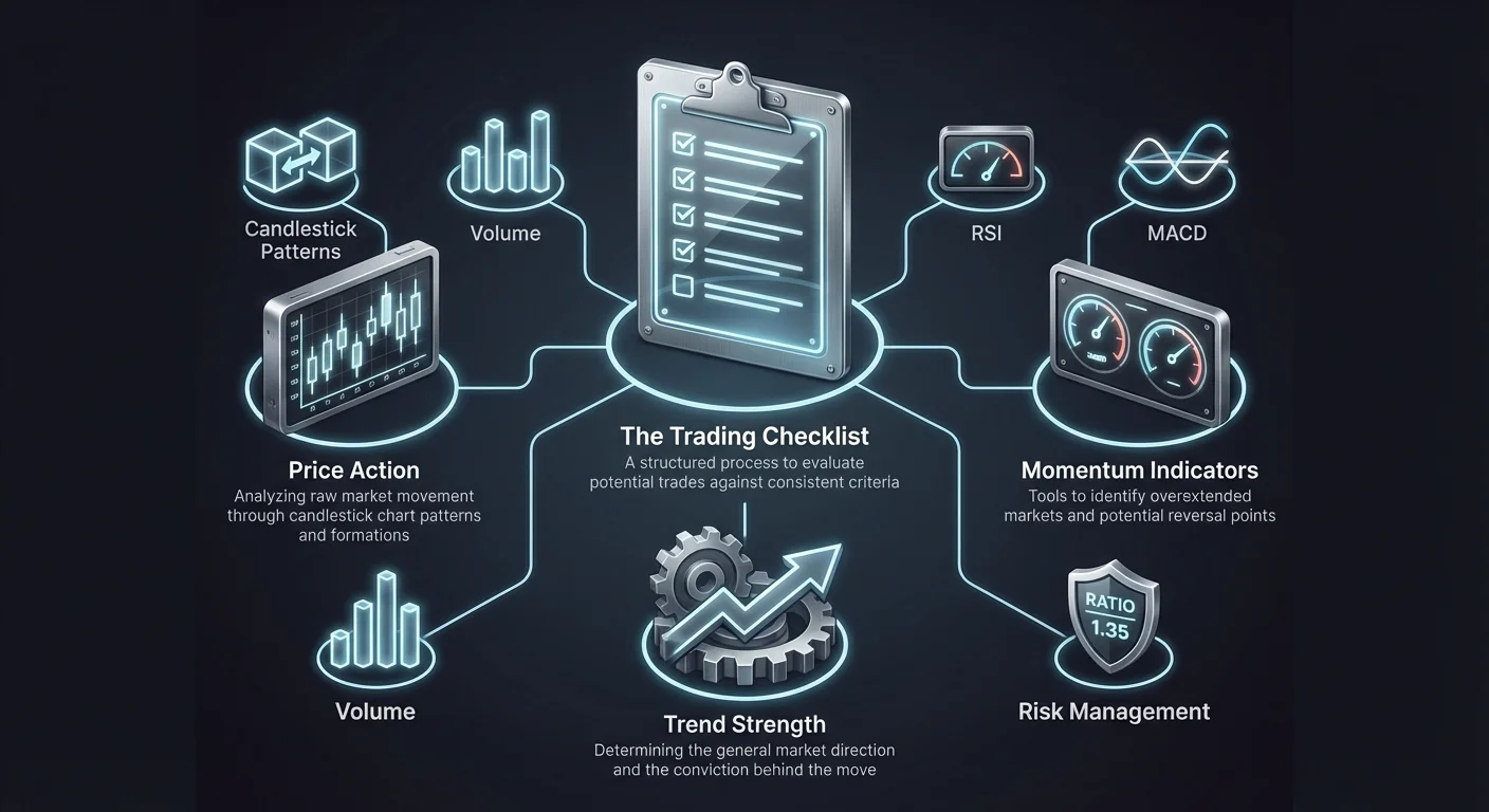
A technical analysis cheat sheet is not about memorizing every pattern in existence. Instead, it serves as a quick-reference guide to the specific indicators and signals that form your personal strategy. This checklist ensures that you evaluate every potential trade against a consistent set of criteria before executing an order. By standardizing your process, you increase the likelihood of repeatable success over time.
The goal is to move from reactive trading, where you chase green candles, to proactive trading, where you wait for the market to come to you. This guide breaks down the essential components of technical analysis, from chart reading to complex indicators. It will help you assemble a robust checklist tailored to identifying high-probability setups while managing the inherent risks of digital assets.
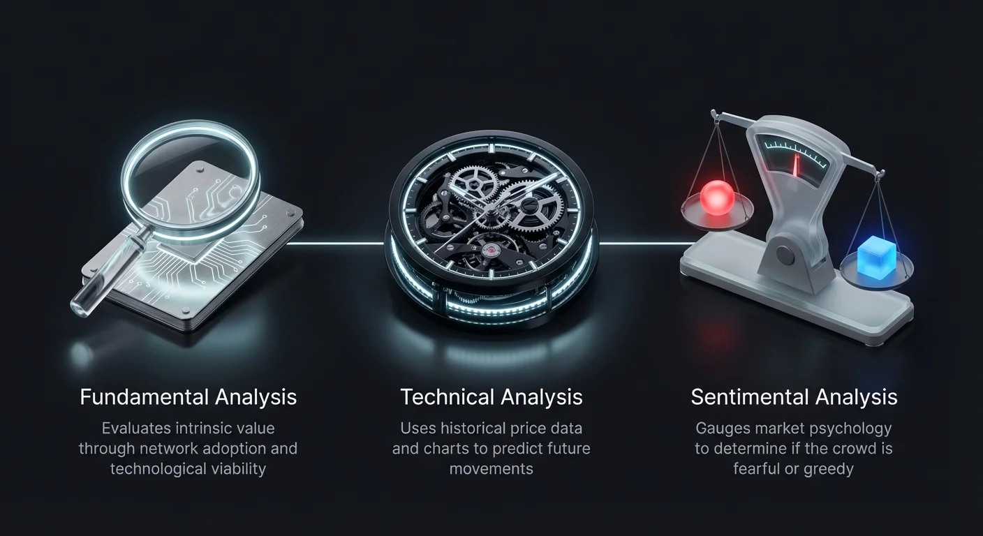
The Three Pillars of Market Analysis
Before diving into specific charts, a solid trading plan considers the broader context. Successful traders often combine three distinct types of analysis to form a holistic view. A checklist should ideally prompt you to check the pulse of the market through these different lenses.
Fundamental Analysis
This method focuses on the intrinsic value of an asset. In traditional markets, this involves earnings reports. In crypto, it looks at network adoption, hashrate, tokenomics, and technological upgrades. Ask yourself if the project has long-term viability. Are there upcoming halving events or protocol updates? This step determines "what" to buy.
Technical Analysis
Technical analysis ignores the "why" and focuses on the "what" regarding price action. It uses historical price data and volume to predict future movements. This is the core of your cheat sheet. It involves reading charts, identifying patterns, and using mathematical indicators to time entries and exits. This step determines "when" to buy or sell.
Sentimental Analysis
Markets are driven by human psychology. Sentimental analysis gauges whether the crowd is fearful or greedy. Tools like the Fear & Greed Index or social media volume can reveal extreme emotions. When the crowd is overly euphoric, a top might be near. When fear dominates, it might be a buying opportunity. This step helps confirm if the market mood supports your technical thesis.
Decoding Price Action with Candlestick Charts
The foundation of any technical analysis checklist is the chart itself. Most crypto traders prefer candlestick charts over line or bar charts. Candlesticks provide a visual representation of price movement within a specific timeframe, displaying the open, high, low, and close (OHLC) for that period.
A candlestick consists of a body and wicks (or shadows). The body illustrates the difference between the opening and closing prices. If the close is higher than the open, the body is typically green, indicating bullish pressure. If the close is lower, it is red, signaling bearish dominance.
The wicks show the extreme high and low prices reached during the session. Long upper wicks can indicate that buyers pushed prices up, but sellers forced them back down, signaling potential resistance. Long lower wicks suggest that sellers pushed prices down, but buyers stepped in, indicating potential support.
Recognizing Key Candlestick Patterns
Your checklist should include specific candlestick patterns that signal potential reversals or continuations. These patterns help you understand who is winning the battle between buyers and sellers.
The Hammer and Hanging Man
A Hammer appears at the bottom of a downtrend. It has a small body and a long lower wick, suggesting that sellers pushed the price down, but buyers rejected the lower levels. This is a bullish reversal signal. Conversely, a Hanging Man looks identical but appears at the top of an uptrend, signaling that selling pressure is starting to mount.
Engulfing Patterns
An Engulfing pattern involves two candles. In a Bullish Engulfing formation, a small red candle is followed by a large green candle that completely "engulfs" the previous one's body. This indicates a strong shift in momentum from sellers to buyers. A Bearish Engulfing pattern is the opposite, where a large red candle consumes a preceding small green one, marking a potential top.
Doji Candles
A Doji forms when the open and close prices are virtually the same, creating a cross shape. This represents market indecision. Neither buyers nor sellers are in control. While not a direct signal to trade, a Doji often precedes a significant trend reversal or a breakout, alerting you to watch the next few candles closely.
Smoothing the Noise with Heikin-Ashi
Standard candlesticks can sometimes be noisy, showing erratic colors during a trend. Heikin-Ashi candles use a modified formula to average out price data. This creates a smoother visual representation of the trend.
In a strong uptrend, Heikin-Ashi candles are typically green with no lower wicks. In a strong downtrend, they are red with no upper wicks. Your checklist might use Heikin-Ashi to determine the overall trend direction before switching to standard candles for precise entry triggers.
Momentum Indicators: RSI and Stochastic
Oscillators are tools that help identify when a market has moved too far, too fast. They are essential for spotting potential reversal points when the price looks overextended.
Relative Strength Index (RSI)
The RSI is a momentum indicator that moves between 0 and 100. It measures the speed and magnitude of recent price changes. A standard setting uses 14 periods. When the RSI crosses above 70, the asset is considered "overbought," suggesting the price may correct downward. When it drops below 30, it is "oversold," indicating a potential bounce.
However, in strong trending markets, the RSI can stay overbought or oversold for long periods. A more powerful signal on your checklist is "divergence." A bullish divergence occurs when the price makes a lower low, but the RSI makes a higher low. This suggests the downward momentum is losing steam despite the dropping price.
Stochastic Oscillator
The Stochastic Oscillator is similar to the RSI but is often more sensitive. It compares a specific closing price to a range of prices over a set period. It consists of two lines: the %K line and the %D signal line. Like the RSI, it uses a 0-100 scale, with 80 representing overbought and 20 representing oversold conditions.
Traders look for crossovers between the %K and %D lines. A bullish signal occurs when the lines cross in the oversold zone and move upward. A bearish signal happens when they cross in the overbought zone and turn down. Because the Stochastic is highly sensitive, it is best used in conjunction with other indicators to filter out false signals.
| Indicator | Range | Overbought | Oversold | Primary Signal |
|---|---|---|---|---|
| RSI | 0-100 | > 70 | < 30 | Divergence |
| Stochastic | 0-100 | > 80 | < 20 | Line Crossover |
| MACD | Unlimited | N/A | N/A | Zero Line Cross |
Trend Following with Moving Averages
Moving averages (MAs) smooth out price action to show the general direction of the market. They are lagging indicators, meaning they confirm a trend rather than predict it. Your trading plan should define which MAs define your trend bias.
The Golden Cross and Death Cross
Two of the most watched signals involving moving averages are the Golden Cross and the Death Cross. These involve the interaction between the short-term 50-day MA and the long-term 200-day MA.
A Golden Cross occurs when the 50-day MA crosses above the 200-day MA. This is interpreted as a major bullish signal, indicating that short-term momentum is outpacing long-term averages and a new bull market may be starting.
A Death Cross is the opposite. It happens when the 50-day MA crosses below the 200-day MA. This signals that short-term momentum is deteriorating relative to the long-term trend, often warning of a coming bear market or significant correction.
The Pi Cycle Top Indicator
For Bitcoin specifically, the Pi Cycle Top indicator is a unique tool for identifying market peaks. It uses the relationship between the 111-day moving average and a multiple of the 350-day moving average (350DMA x 2).
Historically, when the 111-day MA crosses above the 350-day x 2 line, it has signaled a cycle top within days. While not a tool for daily trading, checking this indicator is valuable for long-term position management. It warns when the market is becoming extremely overheated on a macro scale.
Evaluating Trend Strength: MACD and Volume
Identifying a trend is important, but knowing the strength of that trend is vital. Weak trends are prone to sudden reversals, while strong trends offer safer entry opportunities.
Moving Average Convergence Divergence (MACD)
The MACD is a versatile indicator that tracks both trend and momentum. It consists of the MACD line, the signal line, and a histogram. The histogram visualizes the distance between the two lines.
A basic signal on your checklist is the crossover. When the MACD line crosses above the signal line, it suggests bullish momentum. When it crosses below, it indicates bearish pressure. Additionally, the position relative to the "zero line" is crucial. Being above zero confirms a general uptrend, while being below zero confirms a downtrend.
The Importance of Trading Volume
Volume is often described as the fuel for price movement. It represents the total amount of an asset traded within a specific period. Analyzing volume confirms the validity of a price move.
If the price breaks through a resistance level with high volume, it shows strong conviction from buyers. This increases the probability that the breakout is real. Conversely, if the price rises but volume is decreasing, it suggests the trend is unsupported and may soon reverse.
Volume spikes can also signal capitulation. During a crash, a massive spike in volume often marks the bottom, as panic sellers exit and smart money begins to accumulate. Your checklist should always ask: "Does the volume support this price action?"
Volatility and Market Cycles
Volatility measures the speed and magnitude of price changes. While high volatility increases risk, it also provides the price swings necessary for trading profits.
Understanding Volatility
In crypto, volatility is a feature, not a bug. Low volatility periods, where prices move sideways in a tight range, often precede explosive moves. Bollinger Bands (implied in volatility discussions) or simple range analysis can help spot these "squeezes."
When volatility expands, the market is in motion. Your plan should account for this by adjusting risk parameters. In highly volatile markets, stops might need to be wider to avoid being shaken out by noise, or position sizes reduced to limit dollar exposure.
Cycle Awareness
Markets move in cycles of accumulation, uptrend, distribution, and downtrend. A "Golden Cross" in a distribution phase might be a trap, while an "oversold" RSI in a strong uptrend might not lead to a bounce.
Your checklist must include a "Market Environment" check. Are we in a bull market or a bear market? Indicators work differently depending on the macro backdrop. In a strong bull run, oscillators can stay overbought for weeks. In a bear market, support levels break easily. Identifying the cycle helps you weigh your signals correctly.
Assembling Your Trading Checklist
Now that the components are defined, you can construct the actual checklist. This physical or digital document sits on your desk. You do not enter a trade unless the boxes are ticked.
Step 1: Market Context
- What is the macro sentiment (Fear vs. Greed)?
- Is the long-term trend bullish or bearish (above or below 200-day MA)?
- Are there major fundamental events approaching?
Step 2: Chart Patterns & Price Action
- Is there a clear candlestick pattern (Hammer, Engulfing)?
- Is the price at a key support or resistance level?
- Are Heikin-Ashi candles showing a consistent color?
Step 3: Indicator Confirmation
- Is the RSI showing divergence or extreme readings?
- Has the MACD line crossed the signal line?
- Is the Stochastic Oscillator confirming the momentum shift?
Step 4: Volume & Strength
- Is the move supported by rising volume?
- Is volatility expanding or contracting?
Step 5: Risk Management
- Where is the invalidation point (Stop Loss)?
- Is the Reward-to-Risk ratio at least 2:1?
- Does the position size fit my portfolio rules?
Conclusion
A technical analysis cheat sheet converts the complex noise of the cryptocurrency market into a clear, actionable process. By systematically reviewing trend, momentum, volume, and price action, you force yourself to slow down and evaluate the true quality of a trade setup. This discipline is the primary difference between impulsive gambling and strategic trading.
Remember that no single indicator is a crystal ball. The power lies in the confluence of signals—when the RSI, MACD, and candlestick patterns all tell the same story. Your checklist is a living document. As you gain experience, you will refine it, removing tools that don't serve you and emphasizing the ones that protect your capital.
Consistently following a structured plan is the only way to survive market volatility.