
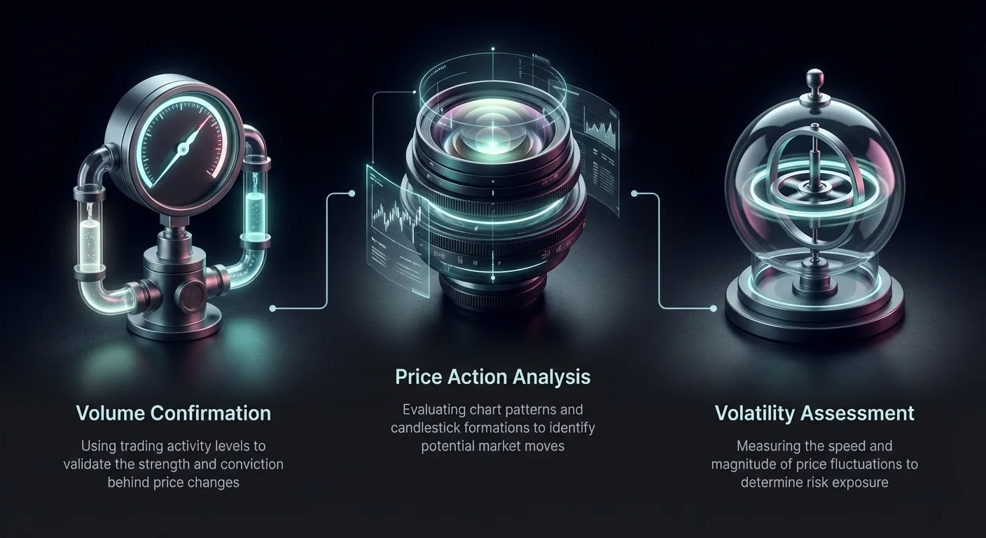
Successful trading in the cryptocurrency markets requires more than just identifying a pattern on a chart. Novice traders often fall into the trap of acting on initial price movements without seeking secondary confirmation, leading to losses from market noise. A breakout might look promising at first glance, but without the supporting evidence of volume and volatility, it is often nothing more than a temporary fluctuation. Experienced market participants understand that price action tells only part of the story.
To navigate these treacherous waters, traders must analyze the underlying strength of a move. This involves looking at how much an asset is being traded and how erratic the price action is during that period. By mastering the relationship between price, volume, and volatility, investors can distinguish between a genuine trend reversal and a deceptive fakeout. This process of validation is the cornerstone of a robust risk management strategy.
This article explores the essential components of technical verification. We will examine how volume acts as a truth serum for price, how volatility metrics define risk, and how specific indicators like Moving Averages and oscillators provide necessary context. By combining these elements, traders can build a comprehensive toolkit for validating market movements and protecting capital.
Decoding Price Through Chart Types
The Superiority of Candlestick Charts
To effectively analyze volume and volatility, one must first understand how price data is visualized. While line charts offer a simple overview of closing prices, they lack the depth required for serious analysis. Most crypto traders prefer candlestick charts because they provide a detailed visual representation of price action within a specific timeframe. Each unit, or "candle," displays the open, high, low, and close (OHLC) data, offering immediate insight into market sentiment.
The body of the candle shows the difference between the opening and closing prices. A green body indicates the price closed higher than it opened, signaling bullish pressure. Conversely, a red body indicates the price dropped, signaling bearish control. This color-coding allows traders to instantly gauge who won the battle during that period—buyers or sellers. This immediate visual feedback is crucial for spotting reversals or continuations in real-time.
Wicks and Market Psychology
Beyond the body, the "wicks" or shadows of a candlestick reveal critical information about volatility and rejection. The upper wick represents the highest price reached, while the lower wick shows the lowest. Long wicks indicate that the market tested a price level but failed to sustain it, signaling indecision or a potential reversal. For example, a long lower wick suggests that sellers pushed the price down, but buyers stepped in aggressively to drive it back up.
These patterns help identify support and resistance levels that may not be obvious on a line chart. When a candle has a small body but long wicks, it often precedes a change in trend direction. Understanding these nuances is the first step in pairing price action with volume data to confirm the validity of a breakout.
The Mechanics of Trading Volume
Defining Market Activity
Trading volume is the total amount of an asset traded during a specific period. It serves as a direct measure of market activity and interest. If Bitcoin has a daily trading volume of 50,000 BTC, it means that 50,000 units changed hands within that 24-hour window. This metric is vital because it indicates the conviction behind a price move. A price change accompanied by high volume is generally considered more significant than one with low volume.
When major institutional players or large numbers of retail traders enter the market, volume spikes. This surge validates that the current price movement has broad support. In contrast, price movements on low volume often suggest a lack of interest, making the trend susceptible to quick reversals. Volume acts as a "vote" from the market; the more votes cast, the more reliable the outcome.
Liquidity and Slippage
High trading volume is closely tied to liquidity, which is the ease with which an asset can be bought or sold without affecting its price. In highly liquid markets, large orders can be executed smoothly. In low-volume environments, liquidity dries up, leading to slippage. Slippage occurs when a trade is executed at a different price than expected because there were not enough orders to fill the request at the desired level.
Low liquidity increases the risk of volatility, as relatively small trades can cause disproportionate price swings. For traders looking to confirm breakouts, understanding this relationship is key. A breakout in a low-liquidity environment may just be the result of a few large orders rather than a genuine shift in market sentiment.
Validating Trends with Volume
Confirming Breakouts
A breakout occurs when an asset's price moves above a resistance level or below a support level. However, false breakouts, or "fakeouts," are common. To distinguish a true breakout from a trap, traders look for a simultaneous surge in trading volume. When price breaks a key level with high volume, it signals strong momentum and increases the likelihood that the trend will continue in that direction.
If the price rises above a resistance line but volume remains low or average, it serves as a warning sign. It suggests that there is not enough buying pressure to sustain higher prices. In such cases, the price often retreats back into its previous range, trapping traders who entered the position prematurely. Volume provides the necessary confirmation that the market has the energy to maintain the new trajectory.
Spotting Reversals
Volume analysis is equally useful for identifying potential trend reversals. In a healthy uptrend, volume should ideally increase as the price rises. If the price continues to go up but volume starts to decrease, it indicates that the trend is losing steam. This divergence suggests that fewer buyers are willing to enter at higher prices, signaling exhaustion.
Similarly, during a downtrend, a spike in volume often marks a capitulation bottom. This happens when the last of the panic sellers exit the market, and aggressive buyers step in to absorb the supply. This high-volume event creates a "stopping volume" signature that often precedes a market turnaround. Monitoring these volume anomalies helps traders exit positions before a trend collapses.
Understanding Market Volatility
Measuring Price Fluctuations
Volatility refers to the speed and extent of price changes for an asset. It is a measure of uncertainty and risk. In financial markets, volatility is often calculated using standard deviation, which quantifies how far prices deviate from their average over a set period. A highly volatile asset experiences rapid, significant price swings, acting like a rollercoaster with steep ascents and sharp drops.
While high volatility introduces greater risk, it also offers substantial potential for profit. Traders often flock to volatile markets to capitalize on these price discrepancies. However, without proper risk management, the same volatility that drives gains can lead to rapid losses. Understanding the current volatility regime of an asset is essential for sizing positions and setting appropriate stop-loss orders.
Causes of Crypto Volatility
Cryptocurrencies are notoriously more volatile than traditional assets like stocks or fiat currencies. Several factors contribute to this characteristic. First, the market is relatively young and less mature, meaning it has lower overall depth compared to global forex or equity markets. This lack of depth allows single large trades or news events to have an outsized impact on price.
Speculation also plays a major role. Investor emotions, driven by "Fear of Missing Out" (FOMO) or panic selling, can drive prices to extremes very quickly. Additionally, the crypto market operates 24/7, allowing for continuous reaction to global news, regulatory updates, and technological developments. These factors combine to create an environment where double-digit percentage moves in a single day are not uncommon.
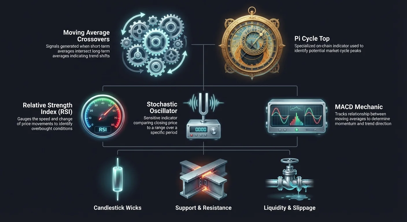
Moving Average Crossovers
The Golden Cross
Moving averages (MAs) smooth out price data to identify trends. Crossovers between short-term and long-term MAs are powerful confirmation signals. The "Golden Cross" is a bullish pattern that forms when a short-term moving average, typically the 50-day, crosses above a long-term moving average, usually the 200-day. This event signals that short-term momentum is outpacing the long-term average, indicating a shift in sentiment.
Traders view the Golden Cross as a confirmation that a downtrend has ended and a new long-term uptrend is beginning. It unfolds in stages: the short-term MA is below the long-term MA, it surges upward to intersect, and finally, it establishes a position above the long-term line. The 200-day MA often becomes a dynamic support level following this event, reinforcing the bullish structure.
The Death Cross
The opposite of the Golden Cross is the "Death Cross," a bearish signal that warns of a potential long-term downturn. This pattern occurs when the 50-day moving average crosses below the 200-day moving average. It suggests that short-term demand is deteriorating and that sellers are taking control of the market structure. Like its bullish counterpart, the Death Cross is a lagging indicator, meaning it confirms a trend that has already started.
Historically, this signal has preceded major bear markets and extended correction periods. Traders using this signal might exit long positions or tighten their stop-loss orders to protect capital. While false signals can occur in choppy, sideways markets, the Death Cross remains a widely watched metric for gauging the health of the broader market trend.
Advanced Cycle Indicators
The Pi Cycle Top
For confirming market peaks, traders often turn to specialized on-chain signals like the Pi Cycle Top indicator. This tool is designed specifically to identify when Bitcoin is becoming overheated and vulnerable to a major reversal. It utilizes two specific moving averages: the 111-day simple moving average (DMA) and the 350-day simple moving average multiplied by two.
A signal is generated when the faster 111-day MA crosses above the 2x 350-day MA. Historically, this crossover has occurred within days of Bitcoin's absolute price peak in previous market cycles, such as in 2013, 2017, and 2021. It serves as a warning that the price has accelerated too far beyond its long-term trend and that the risk-to-reward ratio for new long positions is unfavorable.
Understanding Lag and Limitations
It is crucial to remember that moving average indicators, including the Pi Cycle and crosses, are lagging in nature. They react to price action that has already happened. This means they do not predict the future but rather provide a summary of recent history. Consequently, relying solely on these indicators can result in late entries or exits.
To mitigate this lag, traders should use these signals in conjunction with other forms of analysis. For instance, waiting for a Golden Cross while also checking for increasing volume provides stronger confirmation than the crossover alone. By understanding the limitations of lagging indicators, traders can avoid "whipsaws" where prices reverse direction immediately after a signal is generated.
The Relative Strength Index (RSI)
Calculation and Momentum
The Relative Strength Index (RSI) is a momentum oscillator that measures the speed and change of price movements. It operates on a scale from 0 to 100 and is typically calculated using a 14-period lookback. The formula compares the average gains against average losses over that period to determine the strength of the current trend.
RSI helps traders gauge whether an asset is overextended. It acts as a speedometer for price; if the price accelerates too quickly, the RSI will spike. Conversely, if the price drops rapidly, the RSI will plummet. This provides a quantifiable metric for market emotion, helping to identify periods of irrational exuberance or excessive fear.
Identifying Extremes
The primary utility of RSI lies in identifying overbought and oversold conditions. An RSI reading above 70 is generally considered overbought, suggesting that buying pressure may be exhausting and a pullback is likely. Conversely, an RSI reading below 30 is considered oversold, indicating that selling pressure may be overdone and a relief bounce could occur.
Traders also look for "divergence" between price and RSI. A bullish divergence occurs when the price makes a lower low while the RSI makes a higher low. This indicates that while the price is dropping, the selling momentum is weakening. Bearish divergence happens when the price hits a higher high but RSI makes a lower high, warning of a potential top.
The Stochastic Oscillator
Comparing Price to Range
The Stochastic Oscillator is another momentum indicator, but it functions differently than RSI. Developed in the 1950s, it compares a specific closing price of an asset to a range of its prices over a certain period. The theory is that in an uptrend, prices tend to close near their high, and in a downtrend, they close near their low. Like RSI, it ranges from 0 to 100.
The indicator consists of two lines: the %K line (current price position) and the %D line (a moving average of %K). Traders watch for these lines to cross in specific zones. The Stochastic Oscillator is particularly sensitive and moves faster than the RSI, making it useful for identifying short-term swing trading opportunities.
Interpreting Signals
The Stochastic Oscillator uses slightly different thresholds for extremes than the RSI. A reading above 80 typically signals overbought conditions, while a reading below 20 signals oversold conditions. The most potent signals occur when the %K line crosses the %D line while in these extreme zones. For example, a bullish signal is generated when the lines cross upward while below the 20 level.
However, because the Stochastic is highly sensitive, it can remain in overbought or oversold territory for extended periods during strong trends. Therefore, a high reading does not automatically mean "sell." Traders must wait for the actual crossover or a break back below the threshold line to confirm that the momentum has truly shifted.
MACD Mechanics
Components of the MACD
The Moving Average Convergence Divergence (MACD) indicator tracks the relationship between two exponential moving averages (EMAs), typically the 12-period and 26-period EMAs. The "MACD Line" is the difference between these two averages. A "Signal Line," usually a 9-period EMA of the MACD Line, is plotted alongside it to act as a trigger for buy and sell signals.
A third component, the histogram, represents the distance between the MACD line and the Signal line. When the histogram is above the zero line, momentum is bullish; when below, it is bearish. The MACD is unique because it combines trend-following elements (moving averages) with momentum elements (the difference between them), providing a versatile view of market health.
Signal Line Crossovers
The primary trading signals from the MACD come from crossovers. A bullish crossover occurs when the MACD line crosses above the Signal line, suggesting that upward momentum is increasing. A bearish crossover happens when the MACD line crosses below the Signal line, indicating building downward pressure. These signals are often used to confirm trends identified by other means.
Traders also monitor the "Zero Line." When the MACD line crosses above zero, it means the short-term average has risen above the long-term average, confirming a bullish trend. Conversely, dropping below zero confirms a bearish trend. Combining zero-line crosses with signal-line crossovers helps filter out weak signals and aligns trades with the broader market direction.
Integrating Analysis Types
Fundamental Analysis
While technical indicators focus on charts, fundamental analysis assesses an asset's intrinsic value. In crypto, this involves examining network adoption, hash rates, wallet activity, and project development. For example, analyzing Bitcoin's Lightning Network growth or the number of active addresses provides insight into the actual utility and demand for the network, independent of price.
Fundamental analysis acts as a backdrop for technical setups. If technical indicators show a bullish breakout, but fundamental metrics show declining network usage, the breakout may lack long-term sustainability. Conversely, strong fundamentals can provide the conviction needed to hold a position during periods of high volatility, as the investor understands the core value proposition of the asset.
Sentimental Analysis
Sentimental analysis gauges the mood of the market. It involves monitoring news, social media trends, and tools like the Fear & Greed Index. Crypto markets are heavily influenced by crowd psychology. Extreme greed often marks market tops, while extreme fear can signal capitulation bottoms.
By combining sentiment with technicals, traders can spot contrarian opportunities. If the RSI is oversold (technical) and the market is in extreme fear (sentiment), it may present a strong buying opportunity. This holistic approach ensures that trading decisions are not based on a single data point but are supported by a convergence of price, value, and psychology.
Summary of Indicators
| Indicator | Type | Key Signal | Primary Use |
|---|---|---|---|
| RSI | Oscillator | Above 70 / Below 30 | Spotting overbought/oversold conditions |
| MACD | Momentum | Signal Line Crossover | Confirming trend direction and strength |
| Golden Cross | Trend | 50 MA crosses above 200 MA | Identifying long-term bullish reversals |
Conclusion
Successfully trading cryptocurrency requires a disciplined approach to validation. Relying on a single chart pattern or indicator is rarely sufficient in a market known for its rapid fluctuations and noise. By integrating volume analysis, traders gain the ability to confirm the conviction behind price moves, separating genuine breakouts from costly fakeouts. Understanding volatility further aids in managing expectations and setting appropriate risk parameters.
The use of technical tools such as Moving Averages, RSI, Stochastic Oscillators, and MACD provides structured signals that reduce emotional decision-making. However, these tools are most effective when used together rather than in isolation. A divergence in RSI, confirmed by a MACD crossover and supported by high volume, offers a much higher probability of success than any single signal alone.
True market confirmation comes from the convergence of price action, volume intensity, and momentum indicators aligning to tell the same story.